Showing posts with label Communicating GIS 6005. Show all posts

Friday, March 1, 2019

Final Project: Collin County Residential Property Value

My final project for Communicating GIS 6005 was to examine limited variables correlation to single family property values in Collin County, Texas.  The variables considered were number of bedrooms, number of bathrooms, age of property and nearness to Lavon Lake.  Shapefiles for Lavon Lake boundary, Collin County boundary, roads, and floodplain boundary were obtained from Collin County.  Parcel data was obtained from Collin County Appraisal District.  The above infographic contains scatter plots for property value on the x axis and number of bathrooms (top) and number of bedrooms (bottom).  The age of the properties are displayed on purple with a black to white color ramp displaying oldest to newest properties.  The main display is of assessed property values shown on a color ramp from dark blue to bright yellow (low-high).  The main display also includes the floodplain for the area.  Finally in the main display, low in the hierarchy, are primary highways, secondary highways and major arterial roads.  Parcel data was limited to single family residential that were 100% complete and contained information on bathrooms, bedrooms and assessed property value.  Data should be further examined as the property values range from 172 to over $5.5 million.  Those properties of  very low values should be examined for error.

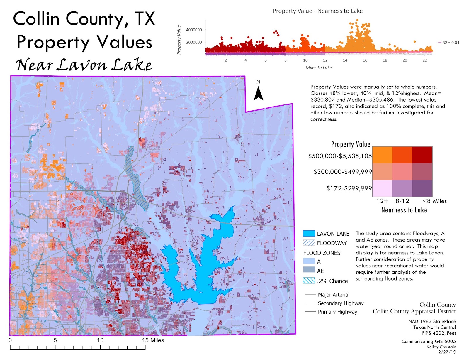
My second infographic includes a scatter plot and bivariate choropleth.  The scatter plot displays distance to lake on the x axis and property values on the y axis.  The bivariate choropleth displays property value in a 3 class manual display (< $300,000 = 48.0%, $300,000-$500,00 = 40.0% and above $500,000 11.8%) and nearness to Lavon Lake in a 3 class quantile class (rounded to whole numbers:  <8 miles = 36.68%, 8-12 miles = 31.5%, more than 12 miles = 31.82%).  The two variable legend classes from lower left as furthest from the lake (more than 12 miles and lowest property values at under $300,000.  to the highest lass upper right with nearest to the lake (within 8 miles) and property values over $500,000.  This display would indicate there is not a significant correlation between the two variables.  This may be due to the floodplain in the area containing floodways that may contain year round navigable waters, allowing access to recreational waters in areas other than the lake.

Sunday, February 17, 2019

Module 6: Proportional Symbol and Bi-variate Choropleth

This week we learned about proportional symbol mapping and bi-variate choropleth (above).

Proportional symbol mapping is a quantitative map that varies the representation of a  feature, and the size, shape, and color vary with the particular variable. This type of map is very appropriate to map data counts.
Our first assignment was to utilize a proportional symbol map to represent the population size of cities in India.  First we were asked to determine the appropriate variables for a custom conic projection for the area.  I utilized a central meridian of 80E and parallels of 30.8N and 12.0N. The symbol properties for the proportional symbol were set with consideration of the background colors and visibility.  Finally a custom legend was created to show the range of symbols utilizing Flannery Appearance Compensation to accentuate the differences in the larger symbols.


Next we moved on to divergent proportional symbology to display jobs gained or lost by state in a time frame of December 2007 and July 2015.  This map creation had many challenges.  First the use of negative numbers does not work for this process.  The original shape file was divided into two shape files utilizing Select by Attribute SQL for <0 and >0.  In the file with the data <0, a new field was created, the field calculator was utilized to obtain the absolute value of those numbers (essentially making them positive).  Due to technical difficulties with loading this data (load times were extreme for even the smallest changes), and the two layers (gains and losses) being set to the same minimum size, line width, and no maximum created different size reference I tried to make the map as completely basic as possible. I am not satisfied with this map, but in the time frame and technical issues this is it.
Update:  Due to the technical issues with ArcPro with proportional symbol for raw count data that I encountered for the above map, I chose to change the symbolization for the raw count data to a dot density map.  More confident in the display of the data in this format.


Finally, we were asked to create a bi-variate choropleth map displaying two variables (% obesity and % physical inactivity)  Bi-variate choropleth maps display two variables (sometimes three = Tri- or Multi-variate) on the same map.  Variables for choropleth maps should be normalized.  These were in the form of %.  Each variable was classed into 3 class quantile classification in order to obtain the break values for the classes.  From the attribute table use of SQL to obtain the records for these classifications were then classed in new fields.  The completion of a column for each variable were then combined using concatenate to a third/final field.  The map was symbolized
with unique values from this final field.  Adjustments were performed to those unique colors by color ramp, complementary color wheel and filling in changes based on Hue (top left and bottom right are complementary - opposite on the color wheel, top right lies between on color wheel) , Saturation (very low or 0 in the bottom left and gradually increase to top right) and Value (lowest in the top right and lowest in the bottom left).  Here is a close up of the legend.  Map appears at top of this post.


Sunday, February 10, 2019

Module 5: Analytics

This week we downloaded 2018 County Health Rankings National Data from http://www.countyhealthrankings.org/explore-health-rankings/rankings-data-documentation 
After downloading the data we were to review and choose two variables that could be related and create an info-graphic from the variables. "The County Health Rankings are based on counties and county equivalents.  The data is a variety of national and state sources that are standardized and combined using scientifically-informed weights."(County Health Rankings & Roadmaps, 2019).

The objective of this lab assignment is to practice the use of a number of different data visualization techniques, including bar charts and scatter plots, as well as the design of communication materials that combine maps and other graphics. We were to select appropriate chart types for our chosen data.  We then created charts for data visualization, including scatter plots, bar charts, and a pie chart.  Finally, we were to combine maps, charts, and text into a single data visualization product (above). 

I chose "% uninsured" and "% frequent mental distress".  I was unable to determine how "% frequent mental distress" was specifically determined, but feel the relationship to Mental Illness would be close.  My hypothesis was that the states with higher mental distress would also have higher uninsured rates.  The correlation being that those with mental illness not able to obtain treatment due to no insurance would lead to higher mental distress incidents.  The scatter plot of the two variables shows some correlation but not as strong as I had suspected.  The bar charts show the high and low states for the variable as well as the national, Florida and Alabama (my specific area).  The area chart illustrates how few of the population are not insured.  I also included a pie chart as well as a simple graphic to show 1 out of 25.

Reference:
County Health Rankings & Roadmaps. (2019). Retrieved from: http://www.countyhealthrankings.org/explore-health-rankings/our-methods [Accessed 8 Feb. 2019].

Sunday, February 3, 2019

Module 4: Color and Choropleth


This week's project was to pick one state from a list provided and extract the state information and map the population change from 2010 to 2014.  I picked Colorado.  Colorado has 2 UTM zones and 3 StatePlane, so these were eliminated as projection choices.  I did not locate a projection specific for the State of Colorado.  I chose to use NAD 1983 (2011) Contiguous USA Albers.  A custom Albers projection adjusted with central meridian and standard parallel would have been better, but I couldn’t figure out how to change them.  The formula I utilized to normalize data to percent of change in population is: (Population 2014-Population 2010)/Population 2010*100.  I used an 8 class manually assigned classification.  I after looking at the natural breaks for a 5 class I decided to take the natural breaks and round them to more user friendly intervals keeping significant breaks for both growth and loss of population.  I also added a critical class for the 0 marker.  I utilized a divergent color scheme to help symbolize those that population increased/decreased.  Darkening greens to indicate increased growth and progressively darker grays for loss of population.


Sunday, January 27, 2019

Module 3 - Terrain Visualization

This week we studied terrain visualization.  We considered contour lines, DEM, hillshade single and multiple light source, and color tinting.  The above map utilized an elevation raster provided for Yellowstone National park and a land cover raster.  The elevation raster was processed with a single light source hillshade tool from the Raster function in the Raster group of the Analysis tab in ArcPro.  The land cover raster categories were generalized into fewer groups and appropriate colors were chosen for each group.  The land cover layer is displayed at 45% transparency to allow the hillshade texture to show through.  Legibility of the map text and message are clear.  Visual Contrast is sufficient to distinguish categories but not abrasive.  Figure Ground is clear between the boundaries of the land cover of Yellowstone park and the grey tones of the hillshade outside of the park.  Hierarchy is demonstrated in text size and element location.  Title is largest text and subtitle is smaller and more ornate.  The north arrow is placed within a non-focus part of the map frame.  The projections and class are in larger font and positioned above author name and date.  Balance was addressed with a centered map frame and main title, large legend is balanced with other map elements.

Sunday, January 20, 2019

Module 2 - Coordinate Systems

This week in Communicating GIS we learned about Coordinates systems, Scale and Projections.  For the map above we were tasked with selecting one US State other than Florida and creating a general reference map layout for that area of interest.  The layout should be in a coordinate system appropriate for the state.  Although State Plane and UTM projections are quite common in the US, not all states fit in a single zone of said projections.  Texas has 5 State Plane zones and 3 UTM zones.  Projections for UTM and State Plane are zone specific and as such neither of these would be appropriate for the state of Texas.  Fortunately there are several projections that are appropriate for the entire state.  I chose to use NAD 1983 (2011) Texas Centric Map System.  This projections is a Lambert Conic conformal map.  The central meridian is at -100.  The standard parallels are at 27.5 and 35.0.  This projections is specific for the state of Texas and conformal, retains shape, making it an appropriate projection for a general reference map for Texas.

Wednesday, January 16, 2019

Module 1 - Map Design and Typography


In this the first week in Communicating GIS 6005, we worked on Map Design and Typography.  The above map was made from an unfinished map with unclear symbology and simplified to show areas of entertainment in Austin, TX.  The major roads are symbolized as 70% grey at .75 line width to not overpower the area with roads.  The hydrology layer is symbolized as a blue, golf as green.  Both have matching outline color to simplify appearance.  The community centers/recreation centers are a 12pt circle with red fill and black outline to stand out.

1.       Legibility:  Symbol Size, Text size and Font, color
2.      Visual Contrast:  Color choice – bright without a different outline color against white background
3.      Figure Ground:  Color and Size and Detail – grey for roads with labels that are smaller and lighter in text than the large event symbol with larger font in all caps for a short name field added to attribute table
4.      Hierarchical Organization:  Color, Size and Detail – The focus information, location of venues have larger, darker colored symbols with larger, black all cap labels.  The roads are not full saturation with smaller Cap/lower case labels.  The golf course and water features are bold colors not as saturated with no labels. 

5.      Balance:  I started with Travis county orientation on the map, later in instructions an indication that layer was not required.  I was able to enlarge the relevant data with the elimination of Travis County boundary.  Title at the top and map elements located within the data frame around the bottom.

The second map took an existing map designed as a conservation poster and modified to create the above report map.  The elements were resized and color palate changed to highlight the report areas of interest and the harvest values added.

1.       Legibility:  Symbol Size, Text size and Font
2.      Visual Contrast:  Color choice – Wood colors of green and brown with areas of restriction in grey against white background
3.      Figure Ground:  Color against white
4.      Hierarchical Organization:  Map is a large element of the map.  The main title is larger and centered from the subtitle giving the location.  The legend and the company logo are roughly the same size.  And the text for the lease values is large in comparison with the other marginalia. 

5.      Balance:  The map frame is located to the right with the heavy title at the top, the important information at the left and the detail information small at the bottom.

The third project was to add typology to this reference map of San Francisco.  The general features were labeled in Arial font in black and varying size. Water features were labeled in Informal Roman in Lapis blue font at differing size based on the size of the elements.  Parks were labeled in a fir green Brandly Hand ITC font.  The Golden Gate bridge is the only landmark labeled at Eris bold ITC font in black.  The topological features labeled with California FB bold font in brown.   Each of the different fonts helps tie together like features and separate those of different categories.

The fourth map was to utilize dynamic label options in ArcPro to find the best label options for the rivers in Mexico.  I used Bell MT font at 11pt in Italic and Ultra Blue with .5 line width Ultra Blue outline.  I chose River Placement with an offset of 1pt and checked the boxes for Measure offset from the feature geometry and May place label at secondary offset.  I unchecked the box for align label to direction of line, because this would turn some labels upside down in orientation to the map.
I allowed Stack label and selected Choose best for the Horizontal alignment and split after space.  The Maximum character per line was set to 17.  No abbreviated or Key number were utilized.  I removed duplicate labels within 1” but repeat minimum of 2”.  Label buffer of 16% eliminated Lacantum, and some of the clutter in the most southeast area of the map.  No minimum feature size was utilized as this eliminated Colorado label.  Line connection was to connect features Unambiguous.


 The final map of the week was absolutely the most difficult.  The task was to organize a final map that is legible and informative while adding to the previous map of Mexico rivers, state boundaries with labels and Cities including the capital, Mexico City.  This map is much more chaotic than I prefer.  My attempt at the task includes:  Rivers the outline on the text was removed.  States where outlined and labeled in leather brown. Labels are in Century 12pt in caps with possible size reduction to 9pt.  Position is land parcel with curved in polygon.  The labels allow stacks.  Minimum feature size labeled is .2” area, to eliminate the smaller states labels.  Cities were limited to those cities with population over 300,000.  Labels for those cities is Arial Narrow 12pt in black with symbol of a bright green with black outline.  Capital is in Arial 12pt in Red with a red star marking the city.