I have to say this was the most intimidated that I have been by any assignment so far. Very little instruction on how to accomplish the assignment was provided. Question: Is the Bobwhite-Manatee transmission line placement acceptable and feasible based on the chosen project objectives? Criteria to be evaluated: 1) Define and quantify Schools (including daycares) within proximity of the transmission line. 2) Quantify homes within proximity of the transmission line. 3) Define and quantify environmentally sensitive lands imposed by the transmission line. 4) Quantify length of the transmission line (cost estimate optional). Deliverables include: 1)power point presentation. 2) slide commentary for power point presentation. 3)Process Summary. 4) Blog post with links to power point presentation and slide commentary. (WHAT?!? I cant do THAT!)
I spent a few days in what felt like running around in circles. I explored the data layers that were provided. Started metadata table, clipped data to study area, and tried to formulate ideas on how to best accomplish the assignment. Although I did get a better understanding of the data than I had I didn't feel I was making any progress toward the assignment.
Direction change to formulating the maps needed to accomplish the assignment. Intersects for environmentally sensitive areas with preferred corridor and 400' buffered line was divided into wetland and conservation. Conservation came together pretty well. Wetland was too chaotic for me, so I narrowed the classifications to types of wetlands (riverine, lacustrine, palustrine and uplands). FYI-uplands are the rest of the area that are not one of the 3. So is everything that is not wetland considered an upland? Not sure.
Downloaded data for schools and daycares from FGDL.org. Intersect for these layers with preferred corridor and 400' buffered line. Another intersect for parcels with preferred corridor and 400' line buffer.
I had a hard time digitizing homes from the aerial. Finally I found I had to "create new feature class" rt click geodatabase-new-feature class-name and type. The intersect for the parcel layer with preferred corridor and 400' buffered line was just repetition with differed layers.
The last criteria, length of the line, I did not create a map. It is the same map as all the others. I just used the measure tool to drop vertices and continue as close as I could down the center of the preferred corridor.
I will admit I was intimidated and didn't think I knew how to accomplish these things. I was able to get all the data I needed from the attribute tables for the intersects and the measuring tool for the line measurement. Not as hard as I thought it would be.
The next hurdle was realizing that my maps were in portrait layout as that fit the map better, but to use in power point I would probably need them in landscape. So I changed up the maps. And then realized when I inserted them to slides it was fine for them to be portrait (learning, learning).
Write the slide commentary, again have never done it so "oh no, I cant do that". But I just started writing what I would say and it came together. Overall - more than a little overwhelming, but how do you climb a mountain? One step at a time. I am sure this is not my most professional presentation - but it is a lot better than I thought I could do.
Here is a link to the power point and the slide commentary.
Power Point
Slide Narrative
Showing posts with label GIS 4043 Intro GIS. Show all posts
Showing posts with label GIS 4043 Intro GIS. Show all posts
Sunday, December 10, 2017

Tuesday, November 21, 2017
Week 12 Georeferencing, Editing & ArcScene
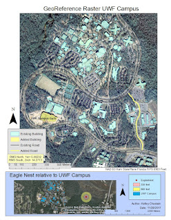
This week I was provided shape files of the buildings and roads on UWF campus that had been geographically referenced coordinate data built in to the files (as has been the other files provided so far). Also proved, two aerial raster files of UWF campus with no referenced coordinate data built in. "Through a process called georeferencing, also called 'image registration', I tell the raster dataset 'where it belongs'. This is done by identifying a common point on the target layer and an already referenced control layer and linking these common points." Since this is a new task, I needed to add the georeferencing toolbar (right click any unoccupied area in the grey area around the toolbars and check georeferencing to add that toolbar). To make the images line up I add control points (clicking that icon from the georeferencing tool bar), clicking first the point on the unknown (raster-aerial) and then the same point on the known (vector - building or road). For best results the points should be spread out not clustered together or in strait lines. Can be tricky accessing points with all of the files in the same window you can either set either the referenced or the unreferenced layer to a transparency (layer properties, display) or a new viewer window (icon in the GeoRef. toolbar) that only displays the raster (this was my choice). When you aren't satisfied the delete the link with another icon on the GeoRef toolbar. After 5 points review the links with the 'view links table' icon. Residual value shows how much each link agrees with how the layer is currently being displayed. The lower the residual value the more accurately that control point is georeferenced. Root Mean Square (RMS) is used to indicate the accuracy of the spatial analysis. The lab pdf indicates the RMS should remain under 15 with 10 control points. Mine was 5.08232 (so I thought I was an expert!), until the second aerial was added and control points were added. This photo was intentionally distorted - HOW RUDE! I was able to get the RMS VERY low with a 3rd Order Polynomial but the map appearance was not matching up well with non control points. At a 2nd Order Polynomial is the RMS was 14.2713, but the map looked more matched up overall. "Higher order transformations allow the raster to bend and warp more than lower order transformations." Update georeferencing (in the georeferencing drop down) to finish.
Next I edited the referenced image by adding a building and a road not in the original building and road files. Again a new task means adding a new toolbar. This time click Editor Toolbar icon on the standard toolbar to display. To begin in Editor Toolbar drop down "start editing". Select the layer to which the edits will be made from the TOC. Select "Create Feature" icon confirm the feature template and select the construction tool in the create features window. Set up additional editing properties like snapping. Select the strait segment icon and start adding vertex. (End point arc was also suggested along with the strait segment icon, I did not use it). Add vertex to keep the shape. Double click vertex to end. Save edits (this is not saved in the map until this selection) end editing session in the Editing tool drop down.
Next a multiple ring buffer was requested to a point file provided marking an Eagles Nest. A hyperlink was directed in the attribute table to a photo of this nest (attribute table icon in the editing toolbar). Add Multiple Ring Buffer tool icon (Customize (main menu-Customize Mode-Commands tab-search Multiple Ring Buffer-click and drag to empty spot on toolbar area). Multiple Ring Buffer tool window requires input, output, buffer unit, and distances). This point is not contained in the aerial files provided. After the buffer was performed a base map was added to show the general location of the nest in relation to the UWF campus buildings. The protection buffer was set to 50% transparent. Here is the map!!

Next I edited the referenced image by adding a building and a road not in the original building and road files. Again a new task means adding a new toolbar. This time click Editor Toolbar icon on the standard toolbar to display. To begin in Editor Toolbar drop down "start editing". Select the layer to which the edits will be made from the TOC. Select "Create Feature" icon confirm the feature template and select the construction tool in the create features window. Set up additional editing properties like snapping. Select the strait segment icon and start adding vertex. (End point arc was also suggested along with the strait segment icon, I did not use it). Add vertex to keep the shape. Double click vertex to end. Save edits (this is not saved in the map until this selection) end editing session in the Editing tool drop down.
Next a multiple ring buffer was requested to a point file provided marking an Eagles Nest. A hyperlink was directed in the attribute table to a photo of this nest (attribute table icon in the editing toolbar). Add Multiple Ring Buffer tool icon (Customize (main menu-Customize Mode-Commands tab-search Multiple Ring Buffer-click and drag to empty spot on toolbar area). Multiple Ring Buffer tool window requires input, output, buffer unit, and distances). This point is not contained in the aerial files provided. After the buffer was performed a base map was added to show the general location of the nest in relation to the UWF campus buildings. The protection buffer was set to 50% transparent. Here is the map!!

Finally this week create a 3D scene in ArcScene. This was the briefest of introductions. I opened ArcScene (start-ArcGIS-ArcScene). Added the same layers; buildings, roads, aerials. Attempted to more around with navigate and fly icons. I opened the property of each layer and in base heights tab selected "floating on a custom surface (from UWF_DEM). I added a layer offset of .1 to the base heights tab of the north aerial to get rid of a black line between the north and south aerials. In the properties of the building layer in the extrusion tab check extrude features in layer, typed "Height" into the expression box, and in apply extrusion by selected adding it to each features maximum height. From the main menu View Scene Properties, general tab, changed vertical exaggeration to 5. Here is that map!

Monday, November 13, 2017
Week 11: Geodocding, Network Analyst & Model Builder
First on the list this week: 1)geocode Emergency Management Service sites for Lake County, FL (addresses from LakeEMS.org). Utilized US Census Bureau Tiger line files after downloading and projecting. Set up and address locator. Utilized table provided with addresses of the locations for Lake County, FL EMS locations to geocode (tie an address to a place in the map). Then researched using Bing maps, the source web site LakeEMS.org to locate those unmatched locations and either selected a candidate from the interactive rematch window or manually placed locations.
Next this week 2)Network Analyst: utilize Arc GIS extension Network Analyst to create a simple route map output. Utilized Network Analyst (customize-extensions-network analyst) to add stops. In the Route properties window (layer properties) from the network analyst window I specified route to be calculated based on travel time in minutes based on a specific day and time. Clicked the solve button from the network analyst toolbar. Looked at the Directions window from the network analyst tool bar. Saved as mxd. Here is my map with the EMS locations, Lake County boundary, Streets layer, and the optimal route showing my 3 stops.

Lastly this week 3)explored simple model in Model Builder. This exercise was completed in ESRI Virtual Campus. Performed edits to an existing model. Input=Blue Oval, Rectangle=Tool, Output=Green Oval. Not sure if the colors and shapes are universal for all models or specific to this one. This model created buffers, performed an intersect of the buffers and final dissolved borders of the intersect to create polygons. Here is a screen shot of the model (looks like flow chart!)

Next this week 2)Network Analyst: utilize Arc GIS extension Network Analyst to create a simple route map output. Utilized Network Analyst (customize-extensions-network analyst) to add stops. In the Route properties window (layer properties) from the network analyst window I specified route to be calculated based on travel time in minutes based on a specific day and time. Clicked the solve button from the network analyst toolbar. Looked at the Directions window from the network analyst tool bar. Saved as mxd. Here is my map with the EMS locations, Lake County boundary, Streets layer, and the optimal route showing my 3 stops.

Lastly this week 3)explored simple model in Model Builder. This exercise was completed in ESRI Virtual Campus. Performed edits to an existing model. Input=Blue Oval, Rectangle=Tool, Output=Green Oval. Not sure if the colors and shapes are universal for all models or specific to this one. This model created buffers, performed an intersect of the buffers and final dissolved borders of the intersect to create polygons. Here is a screen shot of the model (looks like flow chart!)

Monday, November 6, 2017
Week 10: Spatial Analysis (week 2)
This week the map assignment was to utilize shape files to find potential camp sites that are within 300 Meters of a road, 150 Meters of a Lake, 500 Meters of a River and outside of any conservation area. First to buffer the road shape file: Arc Tool Box button, Analysis Tools, Proximity, Buffer, 300 Meters and dissolve (overlapping buffer edges are removed). Next to buffer the water feature class took a few more steps. Separate buffers of 150 Meters for lakes and 500 Meters for rivers. Insert field to the attribute table for the water feature class and name the field buffdist (for buffer distance), right click the new column heading and select field calculator and define the buffers for lakes and then "switch selection" button and define for rivers. Next my first experience with ArcPy (is a Python site package for performing geographic information system (GIS) functions available in ArcGIS). That's right Python, as in programing language! I wrote my first script and practiced inputting multiple scripts to run simultaneously. Next I had to get the water buffer and road buffer together. The lab assigned a Union Overlay and then to export (TOC-Data-Export Data - Selected Features) to a new feature class. Then to do another overlay that would result in the same outcome, I chose an Intersect Overlay. For this exercise, I found no noticeable difference in the outcomes of the Intersect Overlay and the Union Overlay. Then I needed to exclude any conservation areas from my results of possible camp sites. I chose to use Erase Overlay, to remove conservation areas from my results. Next I changed the multi-part layer (only 4 records in the attribute table) to a single-part layer (allowing more specific feature selection). Back to the Arc Tool Box-Data Management-Features-Multipart to Single part. Finally adding a field to the single part attribute table for area and utilizing calculate geometry option for the math to be preformed. It didn't really feel like a lot this week, but writing it all out sure makes it sound like a lot. Here is my final map!

Tuesday, October 24, 2017
Week 7 & 8: Data for GIS and Data Quality (Midterm)
How did I get to the middle of the semester already? How does my instructor think that I can search and find my own data and put it together? Why does she think she can give me two weeks and expect me to manage my time to accomplish said task with very little instructions? Where are my training wheels (Lab pdf with step by step instructions)?
This assignments has spanned two weeks. I was assigned a county, Madison, and told what data I needed to get and to put it together in a maximum of three maps and still display all of the required data.
Most of the data I found by searching FGDL.org meta data explorer. Here are the layers:
This assignments has spanned two weeks. I was assigned a county, Madison, and told what data I needed to get and to put it together in a maximum of three maps and still display all of the required data.
Most of the data I found by searching FGDL.org meta data explorer. Here are the layers:
- County Boundary layer from FGDL.org, vector
- Cities and Towns layer from FGDL.org, vector
- Public Land layer from FGDL.org, vector
- Roads from FGDL.org, vector
- Surface Water from FGDL.org, vector
- Two Environmental Layers of our choice
- Wetlands from FGDL.org, vector
- Land Cover from FGDL.org, vector
- DOQQ (digital orthophoto quarter quad) from Labin.org, raster
- DEM (digital elevation model) from NationalMap.gov, raster
All layers from FGDL.org are in Albers projection so I chose to use that projection for the project (less layers I would need to project into Albers to be sure all layers were in the same projection)
All layers had to be clipped to Madison County Florida with Vector Clip Analysis tool for vector data. The DOQQ did not require clipping as it was smaller than the county. The DEM required Raster Clip data Management tool and limiting the extent of the data shown on the map by Clip the Data Frame. Clip the Data Frame does not clip the data it limits the data features that fall outside of the extent defined (in this case outside of Madison County).
This project had many challenges. Yes, some of them are probably user error as I am still learning. Some came in the form of internet issues. Others I don't know the cause only that when downloading data sometimes it only appears to be downloading as the folder will then turn up empty.
Here are the maps (and again delayed as the jpeg files have not shown up from exporting the mdx files):


Tuesday, October 10, 2017
Week 6 Projections cont.
No finished map to post the week, must say that is a little disappointing for me. I enjoy the satisfaction of a completed map at the end of the lab. No map does not mean that it was a light week. This week was most labor intensive so far. I downloaded aerials (DOQQ), topo quadrangles (DRG), and shapefiles. This doesn't sound to difficult but getting the files to download to my local drive and then access them through my student drive was challenging. I finally resorted to saving the zipped file to local drive and upzipped to the student drive. Either obtained data in State Plane projection or reprojected it to State Plane and then loaded it all in a rough map to be sure it all worked.


- downloaded aerials from Labins.org through the FTP site in State Plane projection
- downloaded Toporgaphic DRG files from Labins.org through FTP site in State Plane projection but when I checked the spatial reference it was undefined projection so I defined the projection as State Plane (since I know that is what I just downloaded)
- downloaded County Boundaries shape file from FGDL.org. Their data is in Alber's projection so I had to reproject this data to State Plane
- downloaded Quad Index from FGDL.org. (Again) Their data is in Alber's projection so I had to reproject this data to State Plane
- Finally I edited XY Tabular data provided for Eagle Nests for the assignment with Degree, Minute, Second geographic coordinates. This had to be converted to Decimal Degrees to work in ArcGIS. I inserted the formula to convert. Then added XY data in ArcMap with an unknown coordinate system. Defined the data as WGS1984 per lab instructions and then reprojected to State Plane


Saturday, September 30, 2017
Introduction to Projections week 5

A
map projection is the result of transforming 3 dimensional earth to a 2
dimensional map. Different projections have different distortions. This could be partially due to the
developable surface (plane, cylinder or cone). The developable surface could be
tangent (touching) or scant (intersecting).
The farther from the tangent or scant the data the greater the
distortion. Map projections can have
some but not all: true directions, true distances, true areas, true shape. Consistent projections are important in
datasets to ensure accurate analysis (don’t want to be comparing apples and oranges).
This weeks map and included table highlight four Florida Counties to be compared in three projections.

Albers, a dual line conic projection, is said to accurately
represent area. UTM, Universal Trans
Mercator, is a cylindrical projection from a meridian (N/S), area and shape are
distorted as distance from the meridian increases. State Plan is not a projection but a
coordinate system that then uses a projection, in this exercise it is Lambert
Conformal Conic, that strength lies more in shape than area. In the comparison of the exercise UTM 16 N
shows the greatest distortion in Miami-Dade county and almost no distortion in
Escambia county. Escambia county is nearly
centered horizontally within the projection area of 16. Miami-Dade is in UTM 17 – farther away from
area 16 and therefore more distortion.
Wednesday, September 20, 2017


Saturday, September 9, 2017
Week 2: Own your map


Lab module 2 went a little smoother, less technical issues. Was able to follow the lab instructions (pretty well). Working with multiple data frames was not as confusing as I anticipated. I really like the zoom to layer for when I get the layout all kinds of off kilter. Zoom to worked well on the Florida map putting it right back in the center of the data frame. Zoom to did not work so well for the Escambia county map. The map was much too small until the data was clipped to Escambia county and even after that it was just not where I wanted it or the right size. I did make some progress in looking at metadata. Publication information and time period is found in the Identification section. Projection and Reference are found in the Spatial Reference section. Defiantly not an expert, but progress. Clipping data worked exactly as the lab instructions indicated, probably need to do that a few more times. "Symbology" table was helpful in making decisions (and not getting too creative). Can't forget the Essential Map Elements: title, legend, scale, north arrow, creators name and the date it was created and don't forget the data source information.
Saturday, September 2, 2017
Lab module 1 process was daunting and at times frustrating for this first timer. Data had to be extracted from the R: drive to my S: drive. 4043 GIS Intro folder. Module 1 folder. Except the first go at this I misspelled Module as "moduel". When I corrected the spelling then I lost my data. So back to extract again. The outline in the overview provided for this lab worked very well. It was slow going for me as this is all so new. Map document (.mxd) does not contain data. To move or share MXD file the data files must go as well. To share the map export it to jpeg (hoping this eliminates the need for data files). I explored the toolbar: zoom in and out, taking notice of the scale display changes 1:1000 being bigger than 1:1000000, similar to fractions 1/1000 is bigger than 1/10000000). I panned all around while zoomed in and lost myself, but was able to center by right clicking World Countries layer and selecting zoom to layer. I looked at metadata in the .xml file. Looking was all I am able to attest to, didn't understand most of it (another opportunity to learn latter). I sorted an attribute table by a field (column) and was able to locate items on my map by locating the record (row) right clicking the farthest left cell and clicking zoom to. I selected islands on the map utilizing the select features tool and obtained information about the islands by show selected records button. I identified parts of my map by utilizing the identify tool. I located areas of my map by using the find tool and then right click the result I need to pan to the location. I used the xy tool to locate on my map and used the measuring tool. Although since the polygon to be measured was irregular shaped I am not sure how there would be a correct answer for a measurement (there would be different answers based on the location of the measurement).

Using ArcGIS Help in my browser was a no go for me. I could pull the web site, and would search, being sure it was for my version 10.5.1, and the result was no results available try again later. So I improvised and used wiki.gis.com and then moved on to the ArcGIS desktop help.
Overall this was a ton of new information. Hopefully I will have less technical issues and be able to move a little quicker next time.
Subscribe to:
Posts (Atom)